Lorem ipsum dolor amet, consect adipiscing elit, diam nonummy.

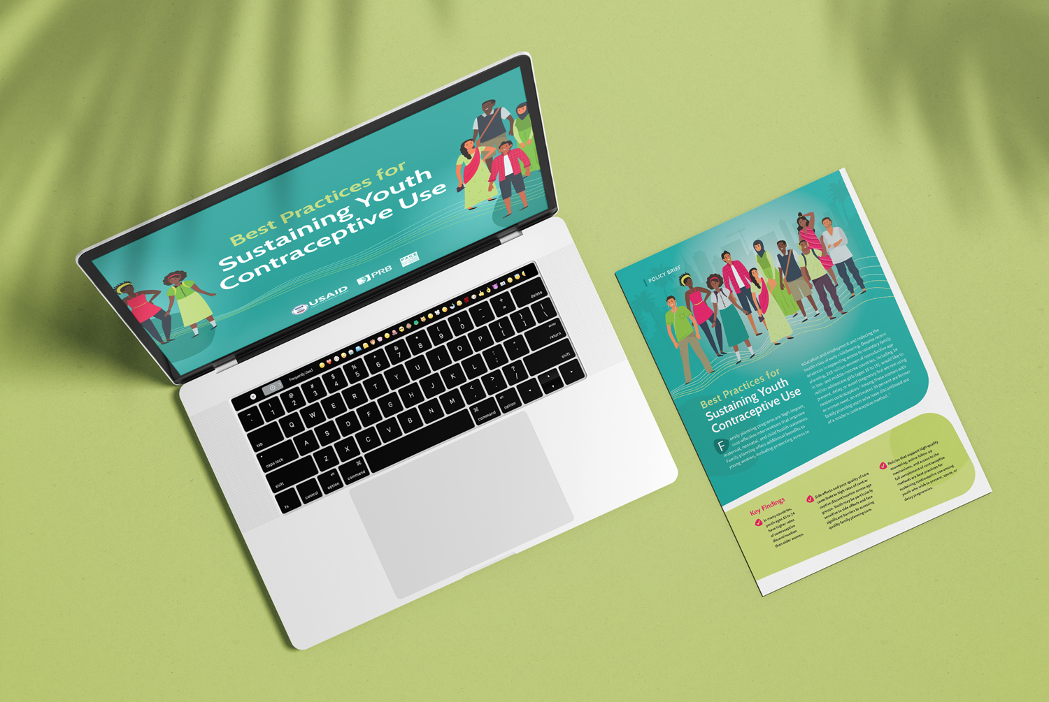
This project began as a simple report advising on policies around increasing youth contraceptive use in developing countries in French and English. We were told that despite the target audience being policy makers, that the report should have a youthful look and feel.
I hired a freelancer, Jamie D’Andrea, to design this report. She proposed this lively approach using illustrative characters throughout. Together, we refined the look and feel.
The client was thrilled with the design of the report and requested an accompanying PPT presentation. I worked closely with the author of the presentation to establish an easy-to-follow PPT structure and then oversaw Jamie’s design work once the wireframes were established.

One of the highlights of the presentation is where we walk through two scenarios where a youth is not able to access contraception. I had the idea to turn it into a timeline where the presenter would click through a series of steps while only subtle changes were made to the slide itself.