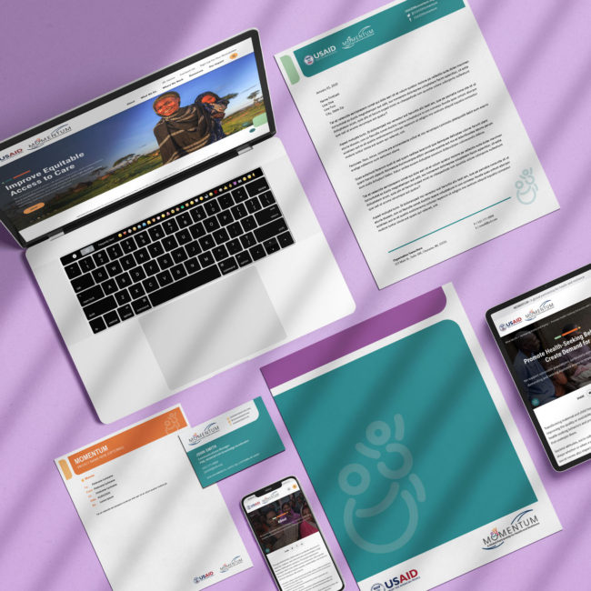
Lorem ipsum dolor amet, consect adipiscing elit, diam nonummy.
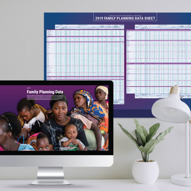
The Family Planning Data Sheet is a poster produced every five years with up-to-date statistics on contraceptive use and women’s health data for every country in the world. 2019 was the first year that a complementary website was developed in conjunction with the printed poster–highlighting noteworthy trends that had been featured on Side B of the poster.
I designed and oversaw printing of the poster and designed and led the development of the website for both mobile and desktop.

The challenge for the Family Planning Data Sheet was to create a design that combined two topics: data and family planning. I wanted the sheet to be recognizably about family planning, with women at the center, and to use our brand palette to represent that without being overtly feminine. When I found this image by Jonathan Torgovnik of women in Kenya waiting in line at a reproductive health clinic, I felt it really brought the data to life.
Formatting the table involved meticulous migration of data from Excel into InDesign. I developed a system of paragraph styles for each type of number so that all data aligned on the decimal.

Historically, only a print poster of the Family Planning Data Sheet had been published. 2019 was our first year to create an interactive web feature to accompany the poster and increase engagement and accessibility to the data.
I designed the site in Sketch, led testing, and oversaw development by an external agency.
The Family Planning Data site was unique in that we already had a print product from which to launch our digital one. It therefore made sense to begin the UX and design planning by wireframing out each section of the print version.
After seeing that each chart and accompanying narrative was essentially a mini-story within itself, I decided that a single-page site would be most user-friendly and would allow the user to scroll through interesting content without getting lost in a series of pages.


One of the first design elements I created was the nav bar. The main goal with the nav bar for this site was simply to provide users with a touchpoint for where they were located and give them an additional option for navigation. I knew that we would remove the nav bar in the mobile version, meaning a side nav would be a good desktop option.

One of the biggest UX challenges for the site was designing the mobile versions of each data visualization. While most of these translated relatively easily into desktop versions, some of them needed a different structure in mobile.
An especially challenging graphic was the map which is much harder to interact with on a small surface. Ultimately, I designed an interface that would allow users to select a country from both the map itself and a dropdown with country options. I then designed the screens that followed once the user selected a country, making sure to include obvious navigation back to the original site.
Designing a data-heavy website like this meant LOTS of attention to detail. Our reviews with the developers had to be incredibly thorough to catch any data or spelling errors, no matter how small. Each list of countries needed to be reviewed for consistency and every chart had to be checked to make sure the correct data had been pulled and was showing as it should.
Each of the interactive charts and graphs involved multiple components that needed to be checked for functionality and quality control, from highlighting different data points to ensuring hovers were working to confirming that the right colors were being used to represent different contraceptive methods.