j

Lorem ipsum dolor amet, consect adipiscing elit, diam nonummy.

Follow Us

Search

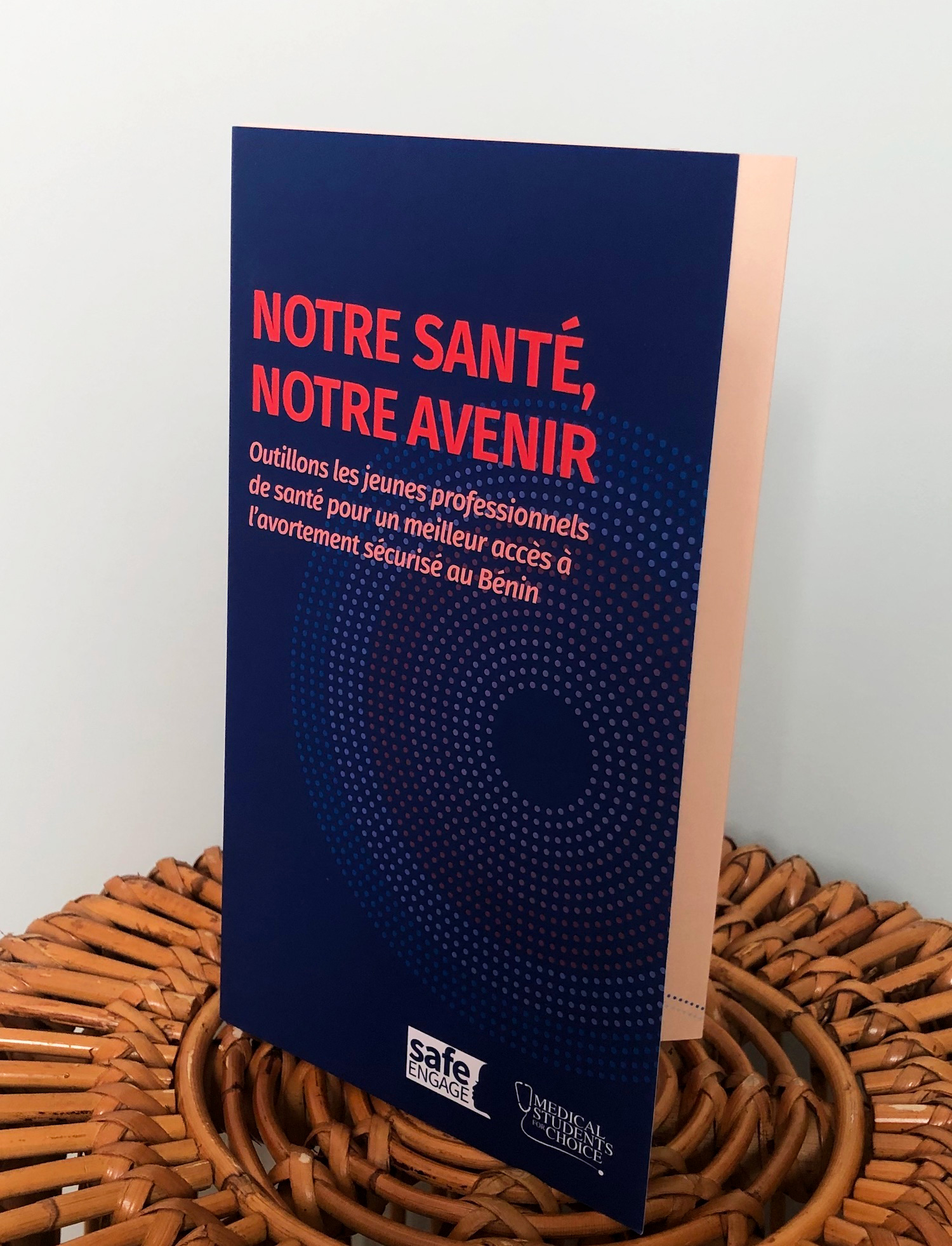
Our Health, Our Future

Empower young health professionals to improve access to safe abortion in Benin
Client: Buffett Foundation
Role: Lead Designer

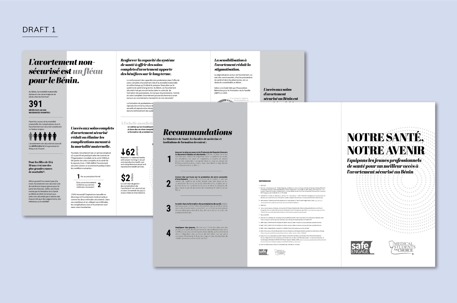
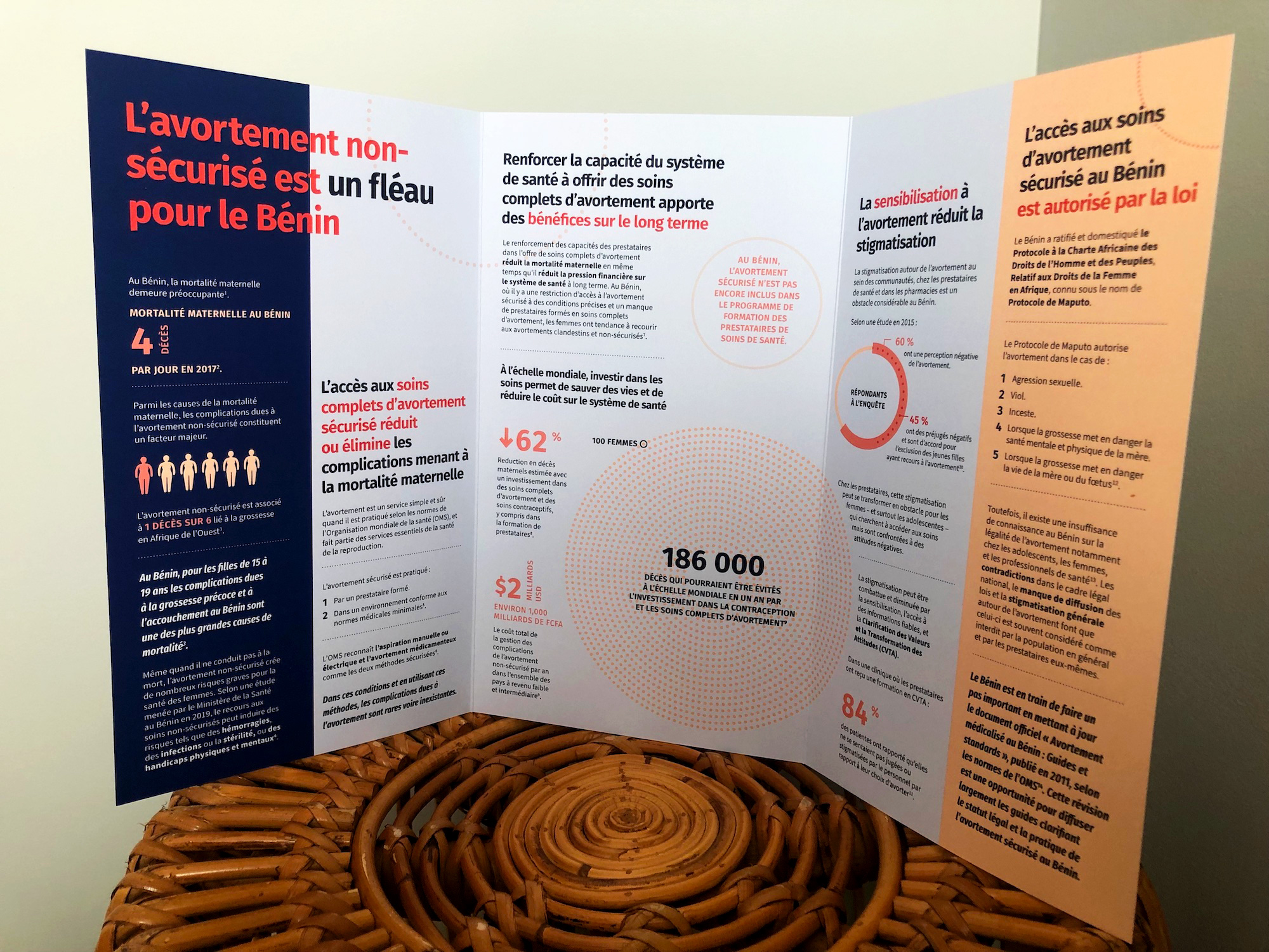
Medical Students for Choice is an international non-profit that ensures medical students are educated about all aspects of reproductive health care, including abortion. During a PRB-led training with the MSC Benin chapter, the students communicated to our staff that they would like a booklet-type document which could be distributed to Benin’s Ministry of Health and medical institutions.

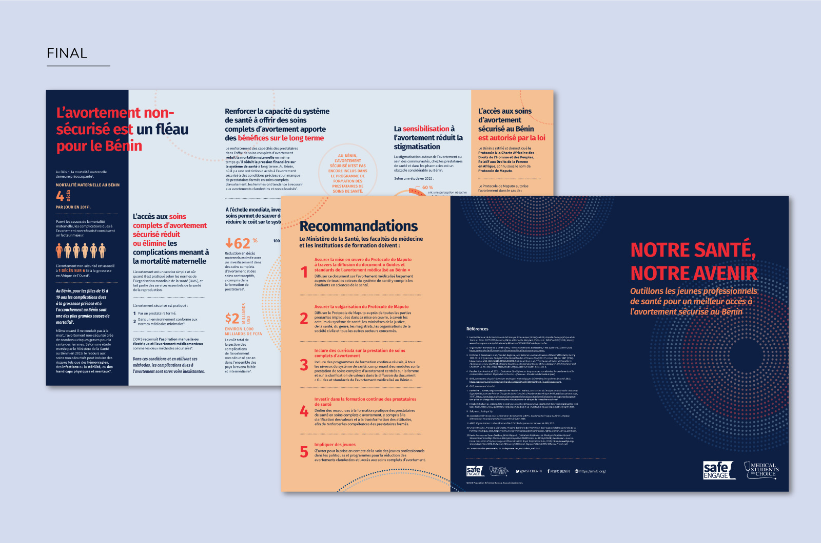
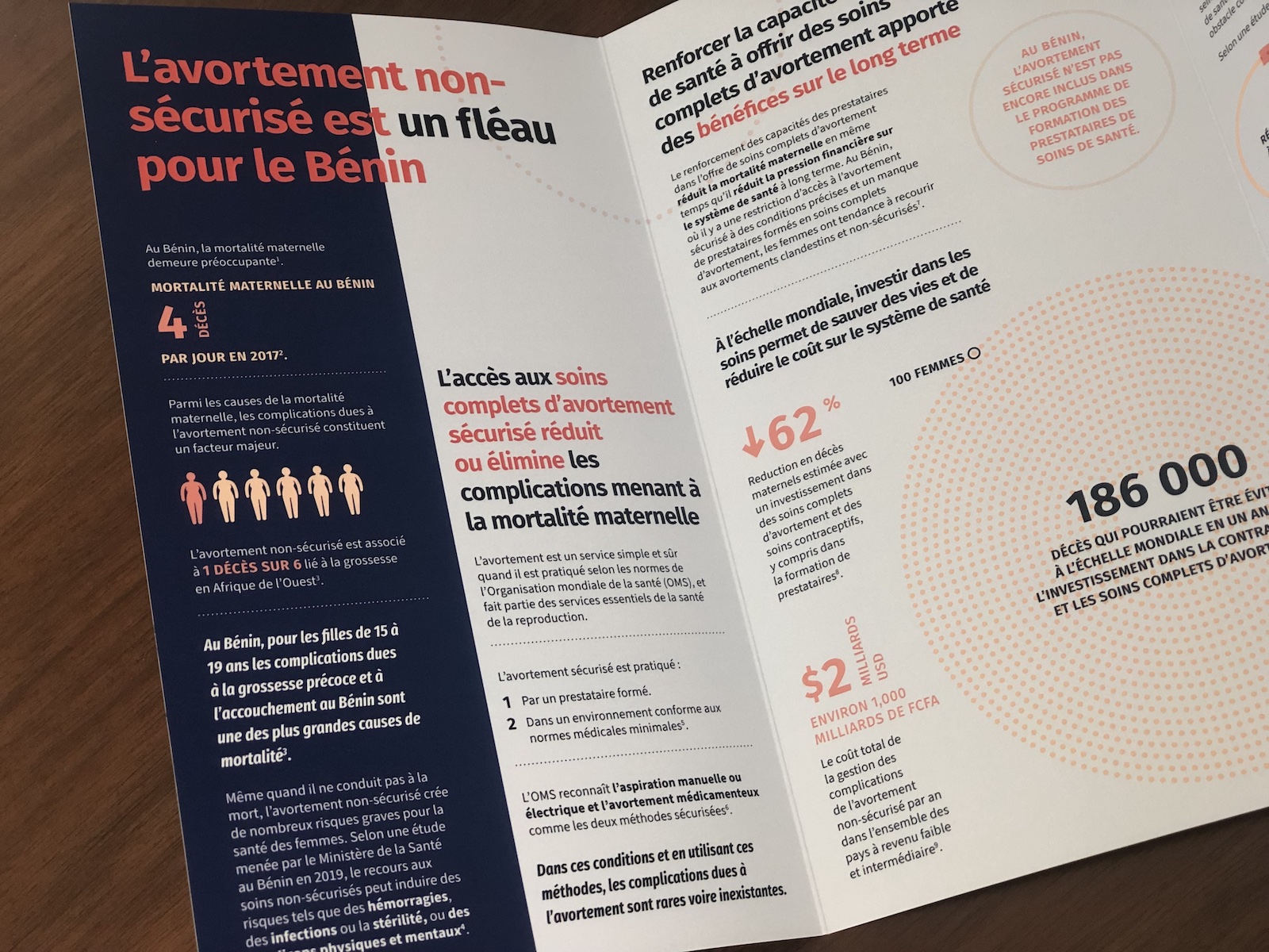
I was brought onto the project to help PRB researchers and MSC Benin identify the product that would best suit their needs. Through a series of QAs with the Benin team, we were able to agree that an oversized trifold would serve our print and digital needs and be a user-friendly product for our target audience. I then led the design and created the custom data visualizations used in the trifold.

A collaborative design

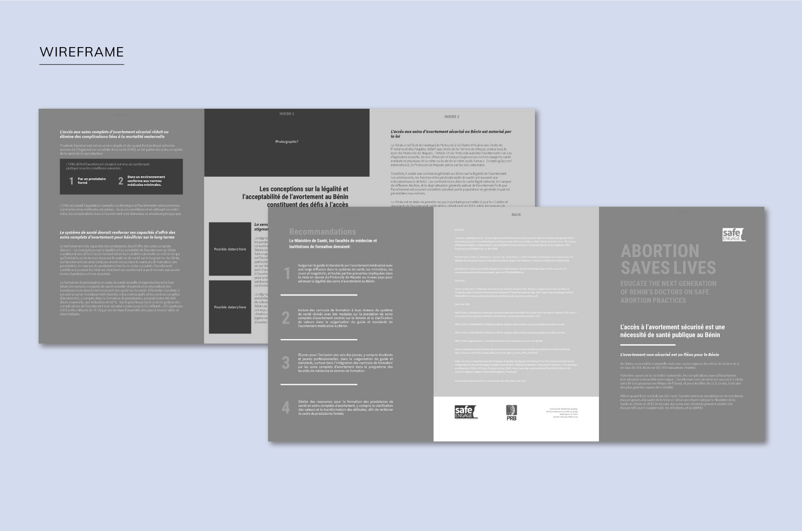
Because the type of product this trifold would be had changed over time, the wireframe was crucial to ensure all the content they wanted to include would fit nicely within the bounds of six panels.

UX Design

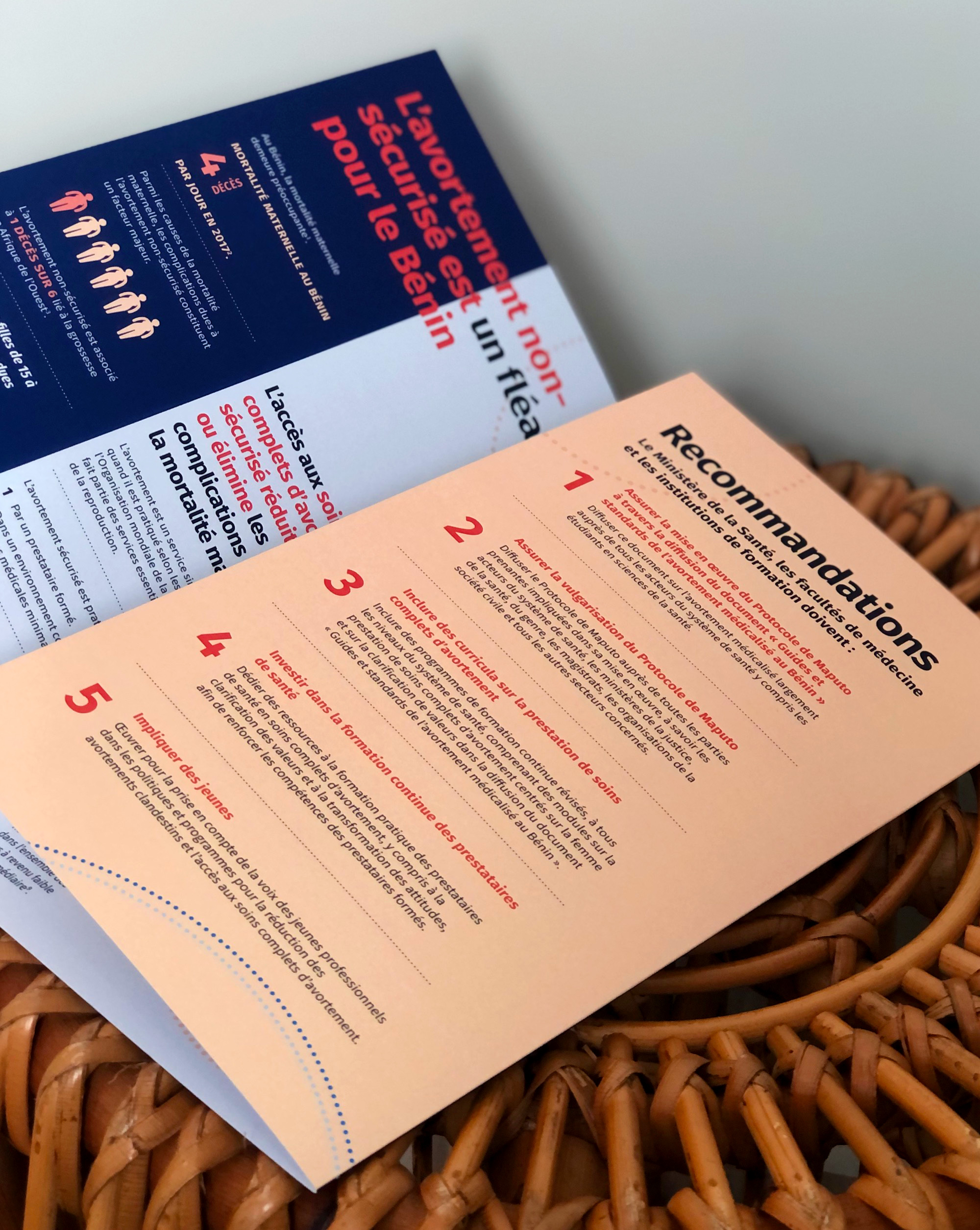
The trifold included recommendations for the policy makers who would be receiving this document. Walking through the policy maker’s experience holding, opening, and reading this product, I found that a logical place for the recommendations would be the inside fold panel.

The reader would be presented with two options upon opening the trifold and seeing the recommendations:

  1. Choose to read them immediately and then, with the recommendations in mind, read the remaining content which bolsters the recommendations.
  2. Simply note that the recommendations existed and read them at the end.

Either way, notifying the reader of the existence of the recommendations up front would improve the reader’s journey with the document.

Data viz

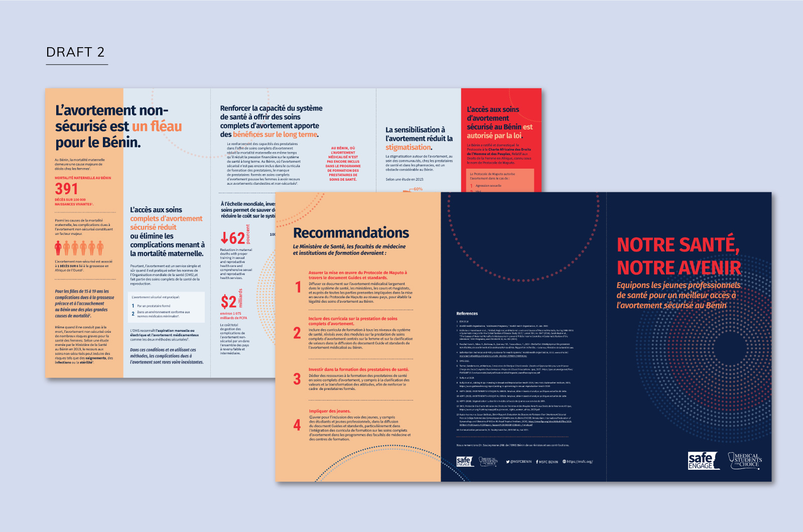
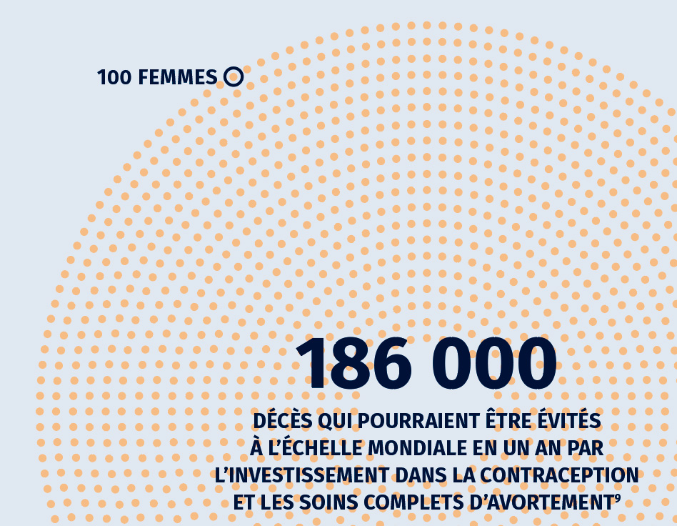
The initial content didn’t include any pulled data points, so the authors and I worked together to identify which numbers could be pulled to add both visual interest and serve as powerful data if the reader was only to skim the piece.

I created the circle viz representing the 186,000 deaths that could be prevented each year with investment in contraception and abortion care. We decided to use this as a design motif that we pulled throughout the document and unified the data and the design.